
In 2017 digital media companies such as Twitch and Reddit began offering dark mode as a feature on their platforms. Following this, in 2018, Apple launched a dark mode in their macOS Mojave and Microsoft in its Microsoft Office. Today dark mode has become popular on mobile phones, websites, and apps, with an estimated 81.9% of smartphone users using it.
So, while dark mode is popular on smartphones, websites, and apps, is it useful on digital signage? Let's investigate!
What is dark mode?
Traditionally content is displayed as dark text on a light background. Dark mode flips this around. It is a display setting where the screen is black or dark, and the text is white or grey. As a result, this reduces the light emitted by the screen. Dark mode can also reduce energy consumption with older screens and extend their life span. However, with newer energy-efficient LED and LCD screens, you don't need to use dark mode to get the same benefits.
Eye Strain
There is evidence that dark mode minimizes blue light exposure and reduces eye strain. The average American spends an estimated 7 hours each day looking at screens. The COVID-19 pandemic further exacerbated the time individuals spent in front of their screens. And it isn't just a single screen; on a daily basis, we look at a multitude of screens, including computers, television, tablets, phones, and digital signage. Digital eye strain is a common side effect of increased screen time. Dry, watery, or tired eyes, headaches, and sore necks and shoulders are all symptoms of eye strain.
Digital signage considerations
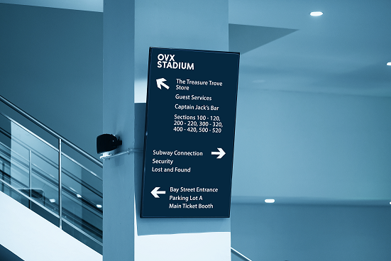
Screen locations: Where are your screens located? Are they close to windows? What are the lighting conditions like? Evaluate the impact the lighting conditions around your screens have on your content's visibility. For example, light text on a dark background can be challenging to read in certain lighting conditions. It may even appear washed out.
Screen types: With OLED and Direct View LED screens, dark mode may provide some energy savings and extend the life of the screen. However, with newer energy-efficient LED and LCD screens, you don't need to use dark mode to get the same benefits.
Time of day: In facilities and venues with lots of windows, a sunny day can impact the viewability of your screens. Consider triggering dark mode versions of designs based on the time of day or by environmental lighting. For example, screens change from a light background during the day to a dark background at night. Additionally, dark text on a light background might be jarring in the evening hours, so switching to dark mode could provide a better experience for the viewer.
Accessibility: Readability depends primarily on color contrast. A high contrast ratio between text and background color makes the text more readable, which is why the Web Content Accessibility Guidelines (WCAG) recommend a minimum contrast ratio of at least 4.5:1 for small text and 3:1 for large text. Run it through a color contrast checker to see if you meet accessibility guidelines. For example, white text on a black background has the highest contrast ratio at a 21:1 contrast ratio, while white on dark grey has a contrast ratio of 12.63:1.
Long story short - dark mode with worth considering! However, each situation is different, so make sure you take into account your screen locations and types, lighting conditions, time of day, and accessibility requirements.